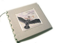
For once I am happy with my most recent portfolio book! For a long time I’ve wanted to do something really different, and I was so tired and bored with the typical glossy-paged, spiral-bound black portfolio cases that most artists carry around. I have several of them! The glossy pages get scratched and bent, and create a glare that is off-putting for me. The black paper inside gets marred and torn from adhesive corner holders or tape.
I considered making my own book using fabric, cardboard, and ribbon – a technique I learned years ago. However, the result has a “craft” look – great for wedding guest books and keepsakes, not for showing art to potential buyers.
My husband volunteered to make a custom wood cover, with rivets to bind the pages together. It would be gorgeous and unique. Either way, I couldn’t easily replace the pages. A portfolio should be updated frequently – and I change my mind about what I want in it constantly.
I wanted something that looked more like a real book. I’ve seen a lot of portfolios – at previous SCBWI conferences, there would be a room where you can view other artists portfolios. At work, we had a client who wanted to put together a binder of work he could show to his customers. So we asked a representative of AI Friedman to come down and show what is available out there. Some of it I’d seen in Michael’s or CC Lowell (my local art store), and some of it I’d seen in the ASW or Dick Blick catalog. But when he mentioned that we should be using the UniBind system, and showed the hardboard covers available, that’s when I said “a-ha!”.
I can print my pages (two-sided, even!), slip them into the cover and set it on the UniBind machine. By re-heating the spine, I can re-arrange, remove, and change my mind as often as I want!
It’s perfect for me. The covers come in standard and unique sizes – I chose the white linen 12×12. The window cutout is charming for my “silly me” painting to peek out of.
Another use I can do is create layouts of family photos, with a selected image for the window or even a type header. I could even paint on the white linen covers. The only snag is that I had to buy 10 of them, and they are all the same. The die cut window was extra, too. The window iss customizable, as well. Oval, square, rectangular, round. Positioning can be pretty much anywhere, too.)
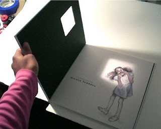
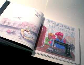
These pics were taken from my little point-and-shoot camera. I’ll upload better pics soon, this gives you an idea of how it looks “in real life”. 🙂
The previous two images are from LUCKY BEANS by Becky Birtha, published by Albert Whitman and Co. just this spring.
“Start strong, end strong” is the motto of any good portfolio. Usually means that what is in the middle isn’t as strong. For me, the middle is the place I put images I couldn’t decided on. In this case, I put in pieces that are my “favorites”. Fantasy, or watercolors that turned out well. Friends, family, colleagues, and art directors agree that many of my personal favorites just don’t belong here! “If you hear the same comments three times or more, there’s the truth” is another well-known saying. So I listened, and have since taken those out. Some of the fantasy pieces should have their own page, though, many people said.
Here’s a sneak peek at my new book IN THE GARDEN WITH DR.CARVER by Susan Grigsby. Watch for it this fall, also from Albert Whitman and Co.
Overall, I’m pleased with the result! Until I make new art, of course. Then I’ll agonize over what to put in and what to take out.:)
